
Web development

Security

B2B

Tools

Productivity & collaboration
The problem
Making threat data understandable
Kaspersky processes vast amounts of cybersecurity data from around the world. The challenge was to transform complex threat statistics into a clear visual experience where users could quickly explore trends, compare regions, and understand how threats spread globally.
The solution
Interactive threat mapping
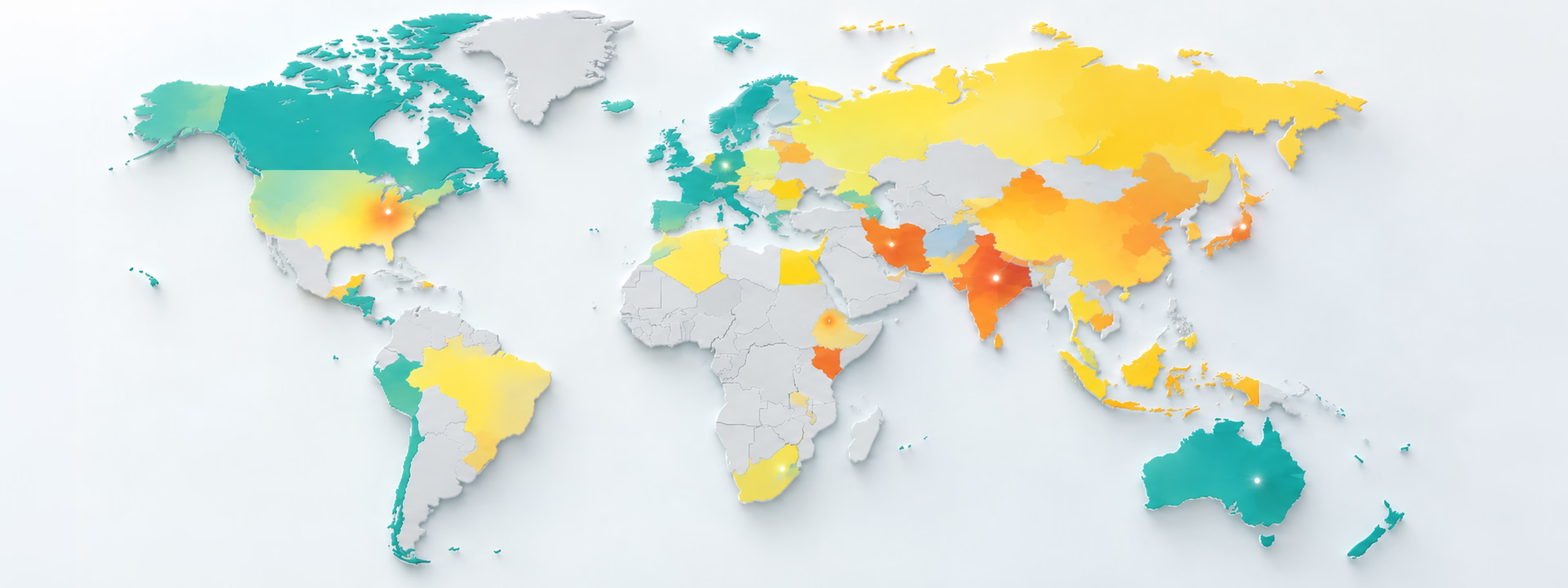
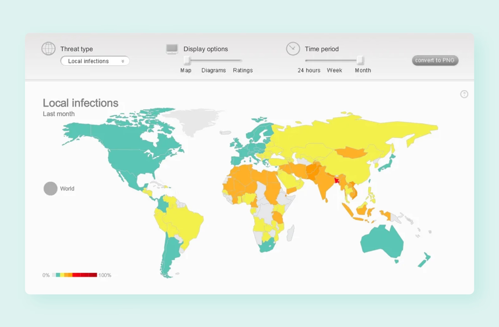
Visualize cybersecurity activity across countries and regions through an interactive world map.
Multiple threat categories
Switch between different types of cyberthreats to explore their geographic distribution and scale.
Geographic drill-down
Move from a global overview to continents and individual countries for more detailed analysis.
Flexible time periods
Compare threat activity across different periods to understand how patterns change over time.
Visual trend analysis
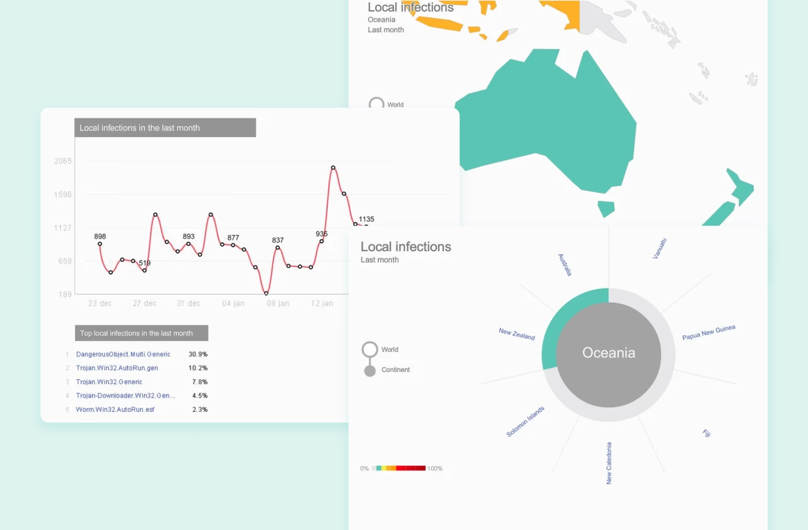
Combine maps, charts, rankings, and diagrams to make complex security statistics easier to interpret.
Threat rankings
Surface leading threats and affected locations alongside geographic data for quick comparison.
Results
3
Geographic levels for exploring threat data — world, continent, and country.
3
Time periods for analyzing activity — 24 hours, week, and month.
4
Visual data views combining maps, diagrams, ratings, and trend statistics.
Key features
Highlights
Interactive threat map
Explore cyberthreat activity across the world, then drill down from a global overview to continents and individual countries for more detailed statistics.
Visual threat analytics
Combine geographic data, trend charts, and threat rankings in one dashboard to reveal patterns and make complex cybersecurity statistics easier to understand.

Let's get in touch
Schedule a call with David to get free tech advice and a comprehensive quote based on over 15 years of industry expertise.
Schedule a call